#HYPEboard
Color Concept.
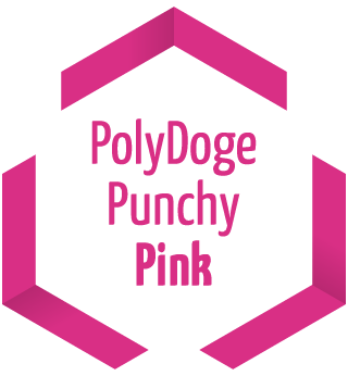
#D92F85
R 217 G 47 B 133
C 0 M 78 Y 39 K 15
Pantone 2039 C
PolyDoge Punchy Pink
You will not find this color in your traditional bank’s visual language. But when it comes to DeFi, we are all trailblazers - plus we get way better APYs & fun features. We promise.
Our main color features in our logo’s typography and will become your best friend in most scenarios when designing for PolyDoge. Use this liberally as a primary color for the most important stuff in your design. Headlines, buttons, icons and hyperlinks are all good examples of what to pinkyfy.

#410056
R 65 G 0 B 86
C 24 M 100 Y 0 K 66
Pantone 2627 C
Ripe Plumb Purple
We know that our primary pink can provide plenty of pop on its own, but if you want it to mellow out, try placing it on this, the deepest of the deep purples.
We went deep on this one, so our purple wants to mostly take a background role in helping out the other players do their thing. Use it for backgrounds and large surfaces. You may want to shy away from using this for smaller stuff placed on a very light background though, since it will look way too dark like the middle column of color codes to the right.
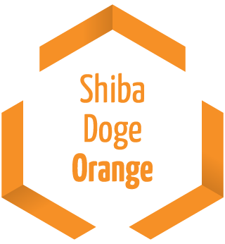
#F69026
R 246 G 144 B 38
C 0 M 41 Y 85 K 4
Pantone 715 C
Shiba Doge Orange
The orange, shiny polygonal coat of our mascot has many shades to it. But when the light hits it just right, you might occasionally catch a glimpse of this delightful shade.
This one is lifted directly from the furry back of our beloved mascot and will be used in extremely rare cases for emphasis. Use it to guide the all-seeing eye of your audience to the most important stuff when it comes to UI/UX and funneling attention to the right places in your designs and projects.
More Colors?
You might want to take a quick look at what we have to say about using other colors in addition to what we have already equipped you with. There is just a few things to keep in mind, as explained below.
You know the drill by now...
Charcoal
Plain old #000000 just doesn’t cut it in a progressive industry like DeFi. Just remember this one simple rule: When designing for PolyDoge, you never go full black.
#333333
R 217 G 47 B 133
C 0 M 78 Y 39 K 15
Pantone 447 C
Polygon Purple
We are standing on the shoulders of giants. In homage to the powerful Polygon network which our humble token calls home, we used this for the shades of our beloved mascot.
#8247e5
R 130 G 71 B 229
C 39 M 62 Y 0 K 10
Pantone 2665 C
Typography.
Yanone Kaffeesatz
Bold, round and cozy headlines.
Our main font, used for headlines, shorter text passages and everything that needs to be big, bold and beautiful, is called Yanone Kaffeesatz. That strangely German-sounding word is indeed German and means “coffee grounds” by the way. But let us try and not read too much into that. Excuse the pun.
Aa Bb Cc Dd Ee Ff Gg Ho Ld
123.456.789.000 þ
Aa Bb Cc Dd Ee Ff Gg Ho Ld
123.456.789.000 þ
Exo 2
A Sans fit for the future.
Our secondary font is mostly used for flowing text that needs to sport better readability, to make things easier on the eyes. We chose Exo 2 for that, because it beautifully compliments the playful rounded shapes of our homegirl Yanone we just introduced you to. And it is doing that while still transporting a futuristic, clean sans-serif look. What more could you ask for?
Aa Bb Cc Dd Ee Ff Gg Ho Ld
123.456.789.000 þ
Aa Bb Cc Dd Ee Ff Gg Ho Ld
123.456.789.000 þ
Currency Symbol þ
Helping an endangered rune stay alive.
We have chosen to use the small letter "Thorn" as our official currency symbol. It originates from an ancient rune of the Elder Fuþark, the oldest of the runic alphabets.
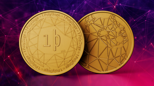
How to type the symbol using your keyboard
On Windows
You can make the þ by pressing and holding ALT on your keyboard and typing 0254 on the numpad.
On Mac OS
You can just use Option+T.
Technical information
Latin Small Letter Thorn
Unicode: U+00FE
HTML-code: þ
CSS-code: \00FE
Entity: þ
Slogans & Messaging
PolyDoge is crypto from the future.
1 PolyDoge = 1 PolyDoge
Logos & Assets



Make your posts look more beautiful.
When designing for Social Media, it is important to keep some basic rules in mind to make sure your post looks beautiful. Resolution, crop and an adequate text size are the main areas things can go south if you don't pay attention.
Rules of the Game
I.
Pick the correct resolution specific to the platform your image is meant for. If there is no specific one chosen yet, your best bet is to stick to commonly used aspect ratios like 4:3 and 16:9 in landscape or portrait orientation.
II.
Crop your images in a way that shows the most important part of your image in a decent size. This assures your message "reads", even when viewed as a thumbnail preview or on smaller mobile devices.
III.
Tend to use bigger text elements to ensure your message maintains readability in the smallest version that may be displayed. A cover image on YouTube for example, needs to not only work in a very large format, but also as a tiny thumbnail.
Social Media Cheat Sheet
Always upload uncompressed source files in the highest quality available.
Single Image Tweet: 1200 x 675 px (16:9)
Double Image Tweet: 700 x 800 px
Instagram
Image Post: 1080 x 1080 px (1:1)
Story: 1080 x 1920 px (16:9)
Shared Image: 1200 x 630 px
Event Image: 1920 x 1080 px (16:9)
Fundraiser Image: 800 x 300 px (8:3)
